welcome flowEmail #1 · Sent immediately
Your wellness transformation starts here 🌱
Email Analysis
# CYMBIOTIKA EMAIL ANALYSIS
═══ BRAND & STYLE OVERVIEW ═══
This email embodies a **premium wellness brand aesthetic** with a clean, modern design and sophisticated restraint. The overall vibe is **aspirational yet approachable**—luxury health and wellness positioned as accessible through subscription. The color palette combines a neutral light gray/off-white base with a rich **deep teal/forest green (#1a4d3e or similar)** as the primary brand color, accented with warm **gold/mustard yellow (#d4af37 or similar)** for highlights and urgency callouts. Typography pairs a clean, modern **sans-serif (likely a geometric sans like Montserrat or similar)** for headlines with the same elegant sans-serif for body copy, creating visual consistency. Spacing is **generous and airy**—significant whitespace between sections, breathing room around images, and deliberate padding that conveys premium positioning.
───────────────────────────────────
## SECTION 1: HEADER / LOGO BAR
**Layout & alignment:**
- Centered horizontally
- Full-width container with top and bottom thin horizontal divider lines (gray, ~1px)
- Logo "CYMBIOTIKA" centered
**Typography:**
- Font: Sans-serif, all-caps, ~18px, weight 600, letter-spacing ~2–3px
- Color: #1a1a1a (near black)
- Text alignment: centered
**Colors:**
- Background: #f5f5f5 (very light gray)
- Text: #1a1a1a
- Divider lines: #cccccc (light gray)
**Padding:** ~20px top, ~20px bottom
───────────────────────────────────
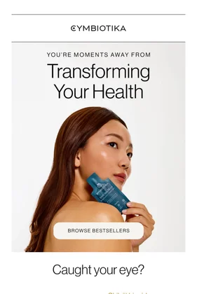
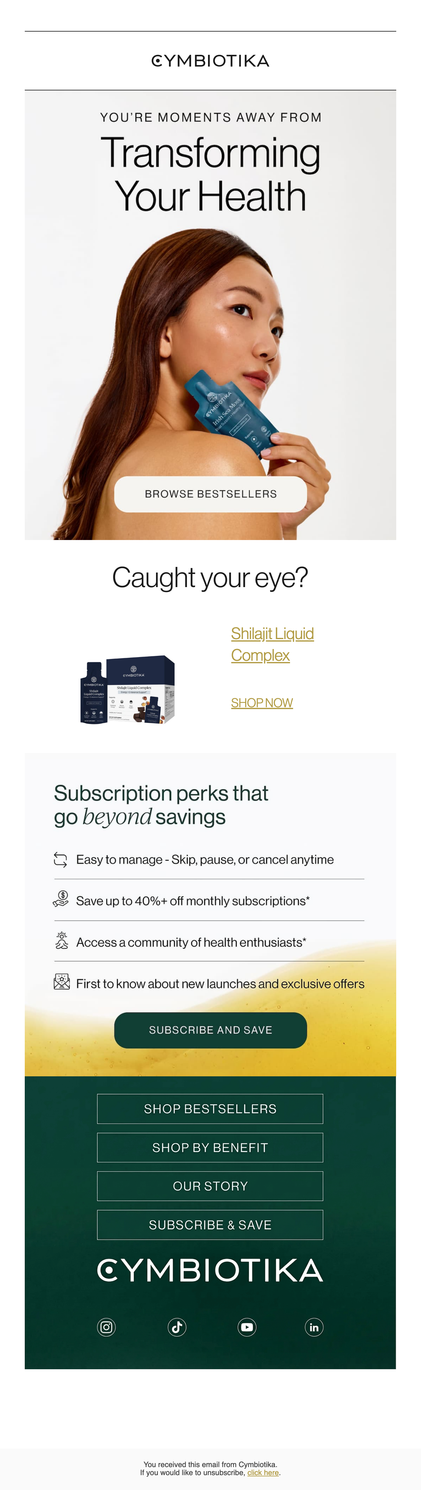
## SECTION 2: HERO IMAGE & HEADLINE
**Layout & alignment:**
- Full-bleed background image (woman with brown hair, holding teal/blue product box, soft studio lighting)
- Content centered both horizontally and vertically
- Image has a light gray/off-white overlay or is naturally pale (#f0ede8 background tone)
**Typography — Overline:**
- Font: Sans-serif, all-caps, ~12px, weight 400, letter-spacing ~1px
- Color: #333333
- Text: "YOU'RE MOMENTS AWAY FROM"
- Alignment: centered
**Typography — Main headline:**
- Font: Sans-serif, ~48–56px, weight 300–400 (light-regular), line-height ~1.2
- Text: "Transforming Your Health"
- Color: #1a1a1a
- Alignment: centered
**Typography — Button:**
- Font: Sans-serif, all-caps, ~12px, weight 600, letter-spacing ~1px
- Text: "BROWSE BESTSELLERS"
- Alignment: centered
- Button: Rounded pill shape (~50px height), background #ffffff, text #1a1a1a, padding ~12px 32px
**Colors:**
- Background: Light gray/off-white (#f0ede8 or similar)
- Text: #1a1a1a, #333333
- Button: White (#ffffff) background with dark text
**Padding:** ~80px top, ~60px bottom (image section is generous)
**Image notes:** The hero image occupies the full width and is ~280–320px tall. Woman positioned on right side of frame, facing left, product held near chin. Lighting is soft, warm, professional.
───────────────────────────────────
## SECTION 3: PRODUCT CALLOUT & "CAUGHT YOUR EYE?"
**Layout & alignment:**
- Centered horizontally
- Two-column layout: left column (~100px wide) for product image, right column for text
**Typography — Subheading:**
- Font: Sans-serif, ~20px, weight 300–400, line-height ~1.3
- Text: "Caught your eye?"
- Color: #1a1a1a
- Alignment: centered (for the full section)
**Product image:**
- Placeholder for navy/dark blue product packaging and bottles (~100px wide, ~120px tall)
- Positioned left-center
**Product name & link:**
- Font: Sans-serif, ~16px, weight 400
- Text: "Shilajit Liquid Complex" (styled as a link in gold/mustard)
- Color: #d4af37 (gold/mustard)
- Underline present (indicating link)
- Alignment: centered under product image
**CTA Link:**
- Font: Sans-serif, all-caps, ~12px, weight 600, letter-spacing ~1px
- Text: "SHOP NOW"
- Color: #d4af37 (gold)
- Underline present
- Alignment: centered
**Padding:** ~40px top, ~40px bottom
───────────────────────────────────
## SECTION 4: VALUE PROPOSITION / SUBSCRIPTION BENEFITS
**Layout & alignment:**
- Full-width, centered content
- Left-aligned bullet points with icons
**Typography — Section headline:**
- Font: Sans-serif, ~28px, weight 400, line-height ~1.3
- Text: "Subscription perks that go **beyond** savings" (word "beyond" in italic)
- Color: #1a1a1a
- Alignment: centered
**Typography — Bullet points:**
- Font: Sans-serif, ~14px, weight 400
- Color: #1a1a1a
- Alignment: left-aligned (within the list container, which is centered)
- Line-height: ~1.6
**Bullet text:**
1. "Easy to manage - Skip, pause, or cancel anytime"
2. "Save up to 40%* off monthly subscriptions*"
3. "Access a community of health enthusiasts*"
4. "First to know about new launches and exclusive offers" (highlighted with yellow background)
**Icons:**
- Small monochrome icons (~24px) positioned to the left of each bullet text
- Icon 1: Curved arrows (skip/manage icon)
- Icon 2: Coin/savings icon
- Icon 3: Community/people icon
- Icon 4: Star/spotlight icon
**Highlight background:**
- Last bullet has a soft yellow gradient background (#fef5d4 to #fff8e8 or similar), full-width
**Padding:** ~40px top, ~40px bottom (bullet section inner padding ~24px)
───────────────────────────────────
## SECTION 5: PRIMARY CTA BUTTON
**Layout & alignment:**
- Centered horizontally
- Full-width with side margins (~60px left/right, leaving ~480px effective width)
**Typography:**
- Font: Sans-serif, all-caps, ~14px, weight 600, letter-spacing ~1px
- Text: "SUBSCRIBE AND SAVE"
- Color: #ffffff (white)
**Button:**
- Shape: Rounded pill (~50px height minimum)
- Background: Dark teal/forest green (#1a4d3e or similar)
- Padding: ~16px 32px
- Text color: #ffffff
**Background gradient:**
- Section has a subtle gradient from light yellow at top (#fff8e8) to deeper yellow at bottom (#f4d576), creating urgency/warmth
**Padding:** ~60px top, ~60px bottom (gradient background section)
───────────────────────────────────
## SECTION 6: FOOTER / SECONDARY CTA BAND
**Layout & alignment:**
- Full-width background color (dark teal #1a4d3e)
- Centered content vertically and horizontally
- Four stacked buttons, equal width
**Typography:**
- Font: Sans-serif, all-caps, ~13px, weight 500, letter-spacing ~0.5px
- Text color: #ffffff
- Alignment: centered
**Button text & layout:**
- Button 1: "SHOP BESTSELLERS"
- Button 2: "SHOP BY BENEFIT"
- Button 3: "OUR STORY"
- Button 4: "SUBSCRIBE & SAVE"
**Buttons:**
- Style: Outlined/bordered buttons (no fill, white border ~1px, transparent background)
- Shape: Rectangular with slight rounding (~4–6px)
- Padding: ~14px 24px
- Border color: #ffffff (white)
- Hover state: (implied) likely white text on teal background
**Logo:**
- "CYMBIOTIKA" (white, all-caps, ~20px, weight 600, centered) positioned between button band and social icons
- Positioning: ~30px below buttons
**Social icons:**
- Four icon links: Instagram, TikTok, YouTube, LinkedIn
- Size: ~20–24px each
- Color: White (#ffffff)
- Spacing: ~16px between icons
- Alignment: Centered horizontally, ~20px below logo
**Padding:** ~50px top, ~50px bottom (full section)
───────────────────────────────────
## SECTION 7: FOOTER / LEGAL
**Layout & alignment:**
- Left-aligned text
- Contained within a thin centered column (~480px)
**Typography:**
- Font: Sans-serif, ~11px, weight 400
- Color: #999999 (light gray)
- Line-height: ~1.5
**Text:**
"You received this email from Cymbiotika.
If you would like to update your email, [CLICK HERE].
Unsubscribe"
**Padding:** ~24px top, ~24px bottom, ~40px left/right
───────────────────────────────────
## OVERALL STRUCTURE SUMMARY
| Section | Visual Height (approx) | Key Element |
|---------|----------------------|-------------|
| Header | ~60px | Logo bar with divider lines |
| Hero | ~300–320px | Large image + headline + button |
| Product Callout | ~160px | Product image + name + link |
| Benefits | ~240px | Headline + 4 bulleted items |
| CTA Band | ~100px | Primary button on gradient |
| Footer Nav | ~280px | 4 buttons + logo + socials |
| Legal | ~80px | Fine print / unsubscribe |
───────────────────────────────────
═══ COPY CONTENT ═══
**Header:**
- CYMBIOTIKA
**Hero:**
- YOU'RE MOMENTS AWAY FROM
- Transforming Your Health
- BROWSE BESTSELLERS
**Product section:**
- Caught your eye?
- Shilajit Liquid Complex
- SHOP NOW
**Benefits section:**
- Subscription perks that go beyond savings
- Easy to manage - Skip, pause, or cancel anytime
- Save up to 40%* off monthly subscriptions*
- Access a community of health enthusiasts*
- First to know about new launches and exclusive offers
**CTA:**
- SUBSCRIBE AND SAVE
**Footer navigation:**
- SHOP BESTSELLERS
- SHOP BY BENEFIT
- OUR STORY
- SUBSCRIBE & SAVE
**Footer social & legal:**
- CYMBIOTIKA [logo]
- [Instagram] [TikTok] [YouTube] [LinkedIn]
- You received this email from Cymbiotika.
- If you would like to update your email, [CLICK HERE].
- Unsubscribe
───────────────────────────────────
═══ STRATEGY ═══
**Email type:** Welcome / Onboarding conversion email (first in series, positioned as "#1" in flow)
**Primary conversion goal:** Drive subscription signup via "SUBSCRIBE AND SAVE" CTA; secondary goal is to drive product browsing and education about subscription benefits.
**Offer details:**
- Up to 40% off monthly subscriptions (conditional on subscription, not one-time purchase)
- Emphasis on flexibility: skip, pause, or cancel anytime (reduces purchase friction)
- Community access and early access to launches as additional value drivers
**Persuasion tactics:**
1. **Aspirational imagery:** Professional, lifestyle-oriented hero image of an attractive woman holding the product, positioning wellness as aspirational
2. **FOMO-adjacent:** "First to know about new launches and exclusive offers" (highlight callout)
3. **Urgency & warmth:** Yellow gradient background on primary CTA section creates warmth and subtle urgency
4. **Social proof implied:** "Access a community of health enthusiasts" (builds credibility)
5. **Flexibility messaging:** Prominent emphasis on ease of management reduces perceived risk
6. **Value stacking:** Multiple reasons to subscribe (savings, community, early access, ease)
**Notable effectiveness drivers:**
- **Clean, premium aesthetic** establishes brand trust and positions products as high-quality wellness, not commodity supplements
- **Strategic color use:** Gold highlights create luxury feel; teal grounds the brand and creates distinctiveness
- **Generous whitespace:** High-end positioning — not cramped or cluttered
- **Clear hierarchy:** Hero → benefits → CTA is a logical progression
- **Mobile-friendly structure:** Stacked buttons and single-column layout scale well
- **Product-specific tie-in:** Showing an actual product (Shilajit Liquid Complex) makes the offer concrete and specific, not generic
- **Benefit-led messaging:** Focuses on what subscription *does* (flexibility, savings, community) rather than just promoting products
This email is highly effective at converting first-time subscribers by balancing premium brand positioning with concrete value propositions and low perceived risk through flexibility messaging.