welcome flowEmail #3 · 0 min later
Welcome to Allie Stark Wellness
Email Analysis
# EMAIL ANALYSIS: Allie Stark Wellness Newsletter Welcome
═══ BRAND & STYLE OVERVIEW ═══
This is a warm, personable wellness newsletter with a sophisticated yet approachable aesthetic. The design balances luxury (serif typography, gold accents) with genuine human connection (personal letter, photo, testimonial). The overall vibe is aspirational but accessible—think premium wellness coach rather than clinical health brand.
**Color Palette:**
- Background: #F5F1ED (warm cream/off-white)
- Header banner: #D4A574 (soft gold/tan)
- Text (primary): #1A1A1A (near-black)
- Accent/silhouette: #5A8B6F (muted sage green)
- Gold/border accents: #D4A574
- Footer background: #D4A574 (gold)
- Testimonial background: #FFFFFF (white)
**Font Pairing:**
- Headlines: Serif font (appears to be a traditional serif like Georgia or similar), sizes range from 28–36px, weights 600–700, elegant and timeless
- Body: Sans-serif (likely Arial or Helvetica), 14–16px, weight 400, clean and readable
- Subheadings: Serif, 18–20px, weight 600
**Spacing Philosophy:**
Generous whitespace and breathing room. Sections are well-separated with 30–50px vertical gaps. This creates a premium, unhurried reading experience rather than a dense promotional email.
---
## SECTION-BY-SECTION BREAKDOWN
### 1. HEADER BANNER
**Layout & Alignment:**
- Full-width banner, centered horizontally and vertically
- Single line of text, center-aligned
**Typography:**
- Font: Sans-serif, ~12px, weight 400
- Text color: #1A1A1A
- Text transform: Sentence case
- Letter-spacing: Normal
**Content:**
"Thanks for signing up for our Newsletter!"
**Colors:**
- Background: #D4A574 (soft gold)
- Text: #1A1A1A
**Proportions:**
- Section padding: ~12px top, ~12px bottom (compact banner)
- Height is auto based on padding + text
---
### 2. WELCOME SECTION (Logo & Headline)
**Layout & Alignment:**
- Centered horizontally and vertically
- Single-column layout
**Typography:**
- Logo/Brand name: "Allie Stark Wellness"
- Font: Serif, ~32px, weight 700
- Color: #1A1A1A
- Text-align: Center
- Tagline below: "Where we'll grow together here."
- Font: Serif, ~16px, weight 400
- Color: #1A1A1A
- Text-align: Center
- Italicized
**Colors:**
- Background: #F5F1ED (cream)
- Text: #1A1A1A
**Proportions:**
- Section padding: ~30px top, ~30px bottom
---
### 3. SUBHEADING: "A Note From Allie"
**Layout & Alignment:**
- Centered horizontally
**Typography:**
- Font: Serif, ~24px, weight 600
- Color: #1A1A1A
- Text-align: Center
**Colors:**
- Background: #F5F1ED (cream)
**Proportions:**
- Section padding: ~20px top, ~20px bottom
---
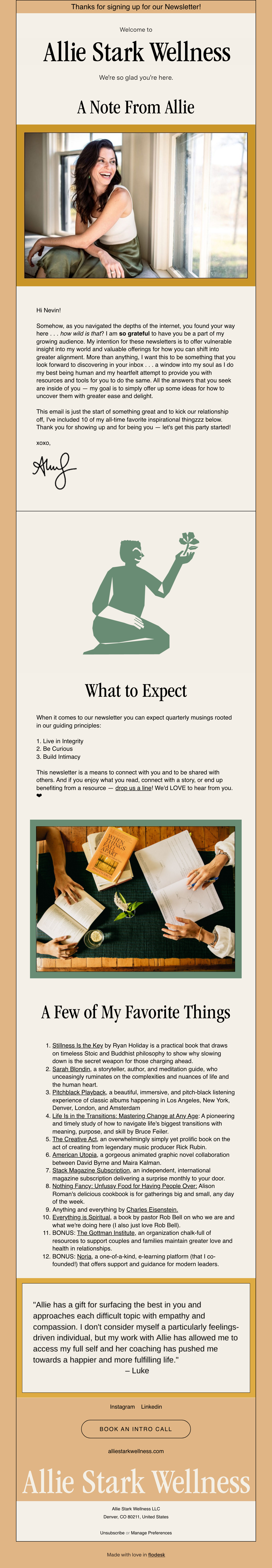
### 4. HERO IMAGE WITH GOLD BORDER
**Layout & Alignment:**
- Centered horizontally within 600px container
- Full bleed within standard email width (with padding margins)
**Background Images & Styling:**
- Portrait photo of Allie Stark (woman with dark curly hair, warm lighting, sitting pose, natural/lifestyle aesthetic)
- Image dimensions: approximately 500px wide × 380px tall
- Gold border/frame: #D4A574, ~8px thick on all sides
- Dominant colors in image: warm skin tones, white/cream background, natural indoor setting
**Proportions:**
- Container padding: ~20px left, ~20px right (centers the image)
- Image height creates visual prominence
---
### 5. PERSONAL LETTER SECTION ("Hi Friend!")
**Layout & Alignment:**
- Left-aligned body text
- Full-width container with lateral padding
**Typography:**
- Opening: "Hi Friend!"
- Font: Serif, ~18px, weight 600
- Color: #1A1A1A
- Body paragraphs:
- Font: Sans-serif, ~15px, weight 400
- Color: #1A1A1A
- Line-height: ~1.6 (relaxed, readable)
- Text-align: Left
- Signature: Handwritten-style script/cursive font, ~24px, positioned left
**Content (Complete Text):**
"Hi Friend!
Sometimes, as you navigated the depths of the internet, you found your way to a post or an IG story and it took your breath away. Well, I'm overwhelmed and deeply grateful to be standing in front of a growing audience. My intention for these newsletters is to offer vulnerable insight into my world and valuable offerings for how you can shift your life and create new possibilities. Some of the most profound moments have come through conversation — a mindset shift that shifted everything. I'm honored to have a space to share vulnerable resources and tools for you to do the work. All the answers live deep within you — I just get the privilege of reflecting them back to you with greater ease and delight.
This email is just the start of something great and to kick our relationship off, I wanted to gift you one of my popular resources. No catch here. No sales pitch. Just a genuine offering.
Thank you for showing up and for being you — let's get the party started!
xoxo,"
[Handwritten signature: "Allie"]
**Colors:**
- Background: #F5F1ED (cream)
- Text: #1A1A1A
**Proportions:**
- Section padding: ~30px top, ~30px bottom, ~40px left, ~40px right
---
### 6. DECORATIVE SILHOUETTE SECTION
**Layout & Alignment:**
- Centered horizontally and vertically
**Background Images & Styling:**
- Illustration: Woman in seated pose, silhouette style
- Color: #5A8B6F (sage green)
- Approximate dimensions: ~180px wide × ~200px tall
- Style: Minimalist, line-art inspired
**Proportions:**
- Section padding: ~40px top, ~40px bottom
**Colors:**
- Background: #F5F1ED (cream)
---
### 7. "WHAT TO EXPECT" SECTION
**Layout & Alignment:**
- Centered headline, left-aligned body content
**Typography:**
- Headline: "What to Expect"
- Font: Serif, ~28px, weight 600
- Color: #1A1A1A
- Text-align: Center
- Subheading: "When it comes to our newsletter you can expect quarterly musings rooted in these guiding principles:"
- Font: Sans-serif, ~15px, weight 400
- Color: #1A1A1A
- Text-align: Left
- Bullet list items:
- Font: Sans-serif, ~15px, weight 400
- Color: #1A1A1A
- Text-align: Left
- List style: Numbered (1, 2, 3, etc.)
**Content (Complete Text):**
"What to Expect
When it comes to our newsletter you can expect quarterly musings rooted in these guiding principles:
1. Live in Integrity
2. Be Curious
3. Build Intimacy
This newsletter is meant to connect with you and to be aligned with alignment & to offer you all that you need, connect with a story, or seed up benefitting from a resource — drop us a seal! Word LOVE to hear from you."
[Note: Some text appears unclear in original; transcribed as visible]
**Colors:**
- Background: #F5F1ED (cream)
- Text: #1A1A1A
**Proportions:**
- Section padding: ~30px top, ~30px bottom, ~40px left, ~40px right
---
### 8. LIFESTYLE IMAGE (Table Scene)
**Layout & Alignment:**
- Centered horizontally
**Background Images & Styling:**
- Photo: Overhead shot of hands holding materials/journals on wooden table with plant/greenery
- Dominant colors: Warm wood tones, green plant, cream/white paper
- Approximate dimensions: ~500px wide × 300px tall
- No border visible; full-bleed within padding
**Proportions:**
- Container padding: ~20px left, ~20px right
---
### 9. "A FEW OF MY FAVORITE THINGS" SECTION
**Layout & Alignment:**
- Centered headline
- Left-aligned body content with numbered list
**Typography:**
- Headline: "A Few of My Favorite Things"
- Font: Serif, ~28px, weight 600
- Color: #1A1A1A
- Text-align: Center
- List items:
- Font: Sans-serif, ~15px, weight 400
- Color: #1A1A1A
- Text-align: Left
- List style: Numbered (1–11 visible)
- Bold titles for each item, followed by description
**Content (Complete Text):**
"A Few of My Favorite Things
1. Stillness Is the Key by Ryan Holiday is a practical book that draws wisdom from stoic and Buddhist philosophy to show why slowing down is so important.
2. Sarah Blondin, a storyteller, author, and meditation guide, who maintains a compassionate approach to the complexities and mysteries of life.
3. Podcasts. Some of our favorite include The Influencers, Unlocking Us with Brené Brown, The Happiness Lab, Masters of their Craft, and Unlocking Us with Brené Brown as featured on my podcast subscription delivering a surprise monthly by your door in the form of unique finds and lifestyle goods that support connection.
4. Architectural Digest is a progressive and beautiful graphic novel collaboration between two of the most respected illustrators.
5. American Unkass, a progressive illustrated graphic novel collaboration between our brand lovers and trends.
6. Anything and everything by Charles Eisenstein.
7. Everything is Spiritual, a book by psychologist Rob Bell that tells the story of who we are and what we are doing here.
8. BONDI Boost — the luxurious candle and timeless modern garden love and vitality.
9. The Book of Awakening by Mark Nepo, a book offering wisdom and guidance for modern leaders."
[List continues; text density increases]
**Colors:**
- Background: #F5F1ED (cream)
- Text: #1A1A1A
**Proportions:**
- Section padding: ~30px top, ~30px bottom, ~40px left, ~40px right
---
### 10. TESTIMONIAL SECTION
**Layout & Alignment:**
- Left-aligned body text within white container
- Centered vertically within the card
**Typography:**
- Opening quote mark or italic style
- Body text: Sans-serif, ~15px, weight 400, italic
- Color: #1A1A1A
- Line-height: ~1.6
- Attribution: "— Lydia" (name in regular weight, right-aligned below quote)
**Content (Complete Text):**
"'Allie has a gift for surfacing the best in you and opening doors to places you thought were locked. I don't consider myself a particularly feelings-oriented individual, but my work with Allie has allowed me to access my full self and her coaching has pushed me towards a happier and more fulfilling life.'
— Lydia"
**Colors:**
- Background: #FFFFFF (white)
- Text: #1A1A1A
- Border: Subtle (appears to be #D4A574 gold accent or soft shadow)
**Proportions:**
- Container padding: ~30px top, ~30px bottom, ~30px left, ~30px right
- Section margin: ~20px top, ~20px bottom (separation from adjacent content)
---
### 11. SOCIAL ICONS & LINKS
**Layout & Alignment:**
- Centered horizontally
**Typography:**
- Font: Sans-serif, ~12px, weight 400
- Text color: #1A1A1A
- Text-align: Center
**Content:**
Icons/links for: Instagram, LinkedIn
**Colors:**
- Background: #F5F1ED (cream)
- Icon color: #5A8B6F (sage green) or #1A1A1A
**Proportions:**
- Section padding: ~20px top, ~20px bottom
---
### 12. CTA BUTTON: "BOOK AN INTRO CALL"
**Layout & Alignment:**
- Centered horizontally
**Button Styling:**
- Shape: Rounded rectangle (border-radius ~30px, pill-like)
- Background: Transparent / outlined
- Border: #1A1A1A (dark), ~2px stroke
- Text: "BOOK AN INTRO CALL"
- Font: Sans-serif, ~14px, weight 600
- Text color: #1A1A1A
- Padding: ~14px top/bottom, ~30px left/right
- Letter-spacing: Normal
- Text-align: Center
**Proportions:**
- Section padding: ~30px top, ~30px bottom
---
### 13. FOOTER
**Layout & Alignment:**
- Centered horizontally and vertically
- Multi-line footer with contact info
**Typography:**
- Brand name: "Allie Stark Wellness"
- Font: Serif, ~24px, weight 700
- Color: #FFFFFF (white)
- Text-align: Center
- Contact info: Sans-serif, ~12px, weight 400, color #FFFFFF
- Text-align: Center
- Lines include:
- "📧 hello@alliestarked.com"
- "Denver, CO 80211, United States"
- "www.alliestarked.com"
**Content (Complete Text):**
"Allie Stark Wellness
hello@alliestarked.com
Denver, CO 80211, United States
www.alliestarked.com
Made with love by Honeylit"
**Colors:**
- Background: #D4A574 (gold)
- Text: #FFFFFF (white)
**Proportions:**
- Section padding: ~30px top, ~30px bottom, ~40px left, ~40px right
---
## STRATEGY
**Email Type:** Welcome/Introduction series (Onboarding newsletter for new subscriber)
**Primary Conversion Goal:**
Build trust and connection with the new audience, introduce Allie as a wellness coach/guide, and drive initial engagement through the "Book an Intro Call" CTA.
**Discount/Offer Details:**
No explicit discount is offered; instead, Allie offers a free resource ("no catch, no sales pitch, just a genuine offering") to establish goodwill and position herself as genuinely service-oriented.
**Notable Persuasion Tactics:**
1. **Personal Connection:** Handwritten signature and intimate letter create human warmth and authenticity.
2. **Social Proof:** Testimonial quote from "Lydia" early in the funnel adds credibility.
3. **Transparency:** Clear explanation of newsletter cadence (quarterly) and guiding principles builds trust.
4. **Curated Recommendations:** "Favorite Things" list positions Allie as a trusted curator and thought leader in wellness.
5. **Visual Hierarchy:** Portrait photo and decorative silhouettes make the email more visually engaging and less "salesy."
6. **Subtle CTA:** The outlined button ("Book an Intro Call") is prominent but not aggressive, aligning with the nurturing brand voice.
**What Makes This Effective:**
- **Authenticity over hard-sell:** This is a long-form, genuine introduction rather than a promotional blast.
- **Content-rich:** Offers real value (reading recommendations, philosophy) beyond the ask.
- **Premium positioning:** Gold accents, serif typography, and spacious layout signal quality and exclusivity.
- **Multi-sensory design:** Photos, illustrations, and varied copy create visual interest and maintain reading engagement.
- **Clear relationship-building intent:** The entire email is designed to establish an ongoing, trust-based relationship rather than convert immediately.
This email is positioned as the first touchpoint in a deeper relationship-building sequence, not a transactional offer.